WordPress Accessibility Day 2023 may have come to an end but it’s only the beginning for implementing what I learnt! It was an event that was very insightful and informative with some great tips on how to make websites accessible for all.
This article is going to show my key takeaways and areas I think most websites should improve to make the internet easier to use for all people.
1. Accessibility beyond Blindness
‘Accessibility beyond blindness’ was a talk presented by Allie Nimmons. She has been kind enough to supply her presentation should you want to give it a read!
When thinking about website accessibility it’s easy to think about the use of screen readers and maybe making the text a little bigger for the old folk. In a way, it is great that these things have been considered but it’s only scraping the surface. We should consider that a website should be accessible for all and we must do everything we can to allow this. Some other people that we should consider and listed and detailed below.
Neurodivergent people – This describes people who process information differently. We must understand what people want to get from the website and make it as easy as possible to achieve that.
Limited Mobility – Users with limited mobility might resort to only using either a keyboard or a mouse. We should enable users to use one or the other and effectively access all content.
Poor Internet connections – Consider how someone in a remote location with a very poor internet connection might view your website if images or fonts fail to load
2. Get Real-Life Data
While this might seem difficult at first it’s really important to understand how you and I might use and navigate a website isn’t necessarily the same way everyone will use it.
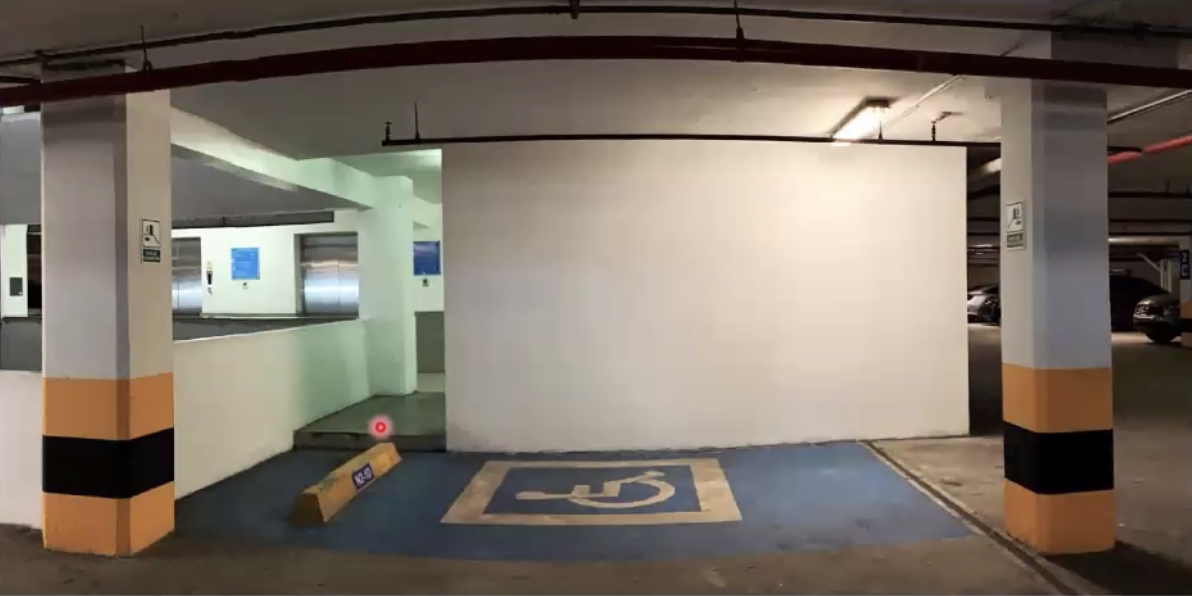
Another way of putting it is this, look at the image below and what do you see?

Well, it’s a well-signed disabled space for blue badge holders. However, for someone who might be using this space, there are numerous issues. The wall makes it a tighter spot than it could be and the two pillars can make it more difficult to park and get out of the space.
While the builders would have followed the guidance on space and colour of the spot there haven’t been the right consultations to see how it affects all people. That’s exactly what we need usability tests, to see how people use your website.
Usability tests are conversations where you listen to the people who should be using the website and then take on board and implement their feedback.
Here are some steps on how to plan a usability test:
- Define clear objectives: What do you hope to learn?
- Choose the testing method (In person, forums, digital feedback forms)
- Select participants and let them get to know you
- Choose the right tasks
- Prepare the environment
- Design Scenarios
- Determine metrics
- Plan for feedback
Once you have your plan it is time to conduct the usability tests:
- Follow a script to stay natural
- Anticipate technical issues
- Encourage feedback
- Take notes
- Diverse data is important
Now its been conducted it’s important to analyse:
- Accessibility Insights
- Patterns over observations
- Severity levels
- Objective & Subjective feedback
- Verbal and non-verbal cues
- Successful & unsuccessful tasks
- Time of each task
- Report
Now you have found your website’s weaknesses you should look to implement the fixes. It could be as simple as some content changes or a restructuring of some pages. However, in many cases, you will need a developer to make some fundamental coding changes to ensure it’s optimised for all users to navigate.
3. Making Navigation easier
A good, well-structured menu will help save bounces, it can be a springboard into other areas of content that would be useful.
Unfortunately, users who only utilise a keyboard to use a website often find issues with navigation menus. Frequently they are unable to access dropdowns, and on the occasions they can achieve this they have no way of getting to the last item without having to tab through everything. As you can imagine on sites with mega menus this can take a-g-e-s. This highlights just one problem a user may face with a navigation menu, below are a few more problems they could face along with the solution.
Problem 1
The navigation menu only produces the dropdown with :hover and not :focus or a click! This prevents people who can’t use mice from accessing the deeper-level navigation.
Problem 2
If the dropdown works on focus there must be the ability to hide the dropdown with the keyboard only.
Problem 3
No aria-expanded attribute. For those who are using a screen reader, they will have no idea if the navigation menu is open or closed. Having this correctly set up will be useful as the reader will know that the ‘About us Menu Item Collapsed’.
How to assess
- Load up a website and use a keyboard only to navigate the website. It’s likely you will only need tab, arrows & esc. Are you able to navigate to the page you want? Was it easy to do? How long did it take to achieve this?
- Inspect the element and identify if it has an aria-expanded=”true” or aria-expanded=”false”. This will tell screen readers if the navigation menu is open or closed, this will dictate if it reads the contents of this.
How to fix
- Modify the NavWalker class with PHP – (https://developer.wordpress.org/reference/classes/walker_nav_menu)
- Fix the CSS so your navigation menu respects both :hover and :focus
- Missing aria-expanded can be resolved with some JS modifying
4. Useful Tools
- Google Lighthouse Test
- WCAG
- easya11yguide.com/learn/theme-accessibility
- make.wordpress.org/themes/handbook/review/accessibility/required


